
When you first logged in to your Free Trial, you saw one of our Dashboards. Here's how they all work.
Our dashboards allow you to look at your data in various different ways and at various different levels of detail. Here are a few of the most popular views:
PL by Department - The P+L by Department dashboard is the first one you see when you log in to your Free Trial. This shows a chart of accounts down the left side, and a hierarchical display of departments across the top. Departments is a generic term we use to describe any separately budgeted business unit, so in your business these may be referred to as Cost Centers, Locations, Programs, Projects etc. And each of them can be part of a Division/Region, which may itself be a part of another, higher level grouping.
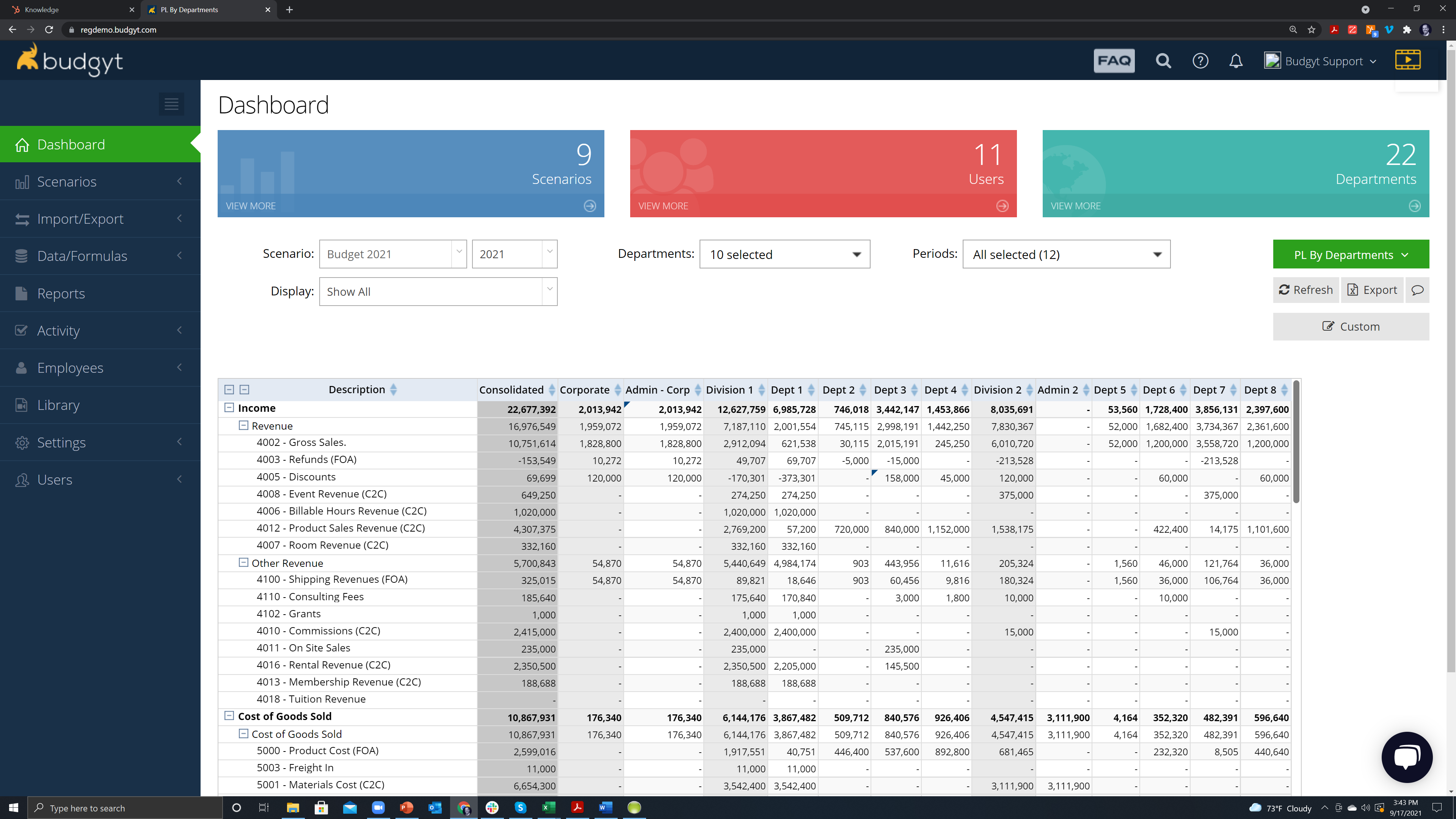
The menus above the data table will allow you to change the data in various ways:
- Scenario - will switch between Actuals, Budgets, and Forecasts. You can build as many scenarios/versions as you need, and they will all be found in this menu.
- Departments - allows you to choose different selections of your departments to view, and is searchable.
- Periods - here you can choose the months to view. We can match your fiscal year in our Preferences.
- The GREEN Menu - this is where you will switch between different dashboard types.
- Also - compress the chart of accounts to immediately see the bottom line using the 2 minus signs at the top left of the table.
PL By Year/Period - If you clicked the green menu, you may have selected this after you looked at the PL by Departments view. Here you can see a 12 month spread of your numbers, with the same menus above for Scenarios, Departments, and Periods. This time though, the Period menu will allow you to select multiple years, so you can see a rolling 12 month view, or a 3 year forecast for example. And the Display menu will reduce the view to a quarterly, or annual view if required.

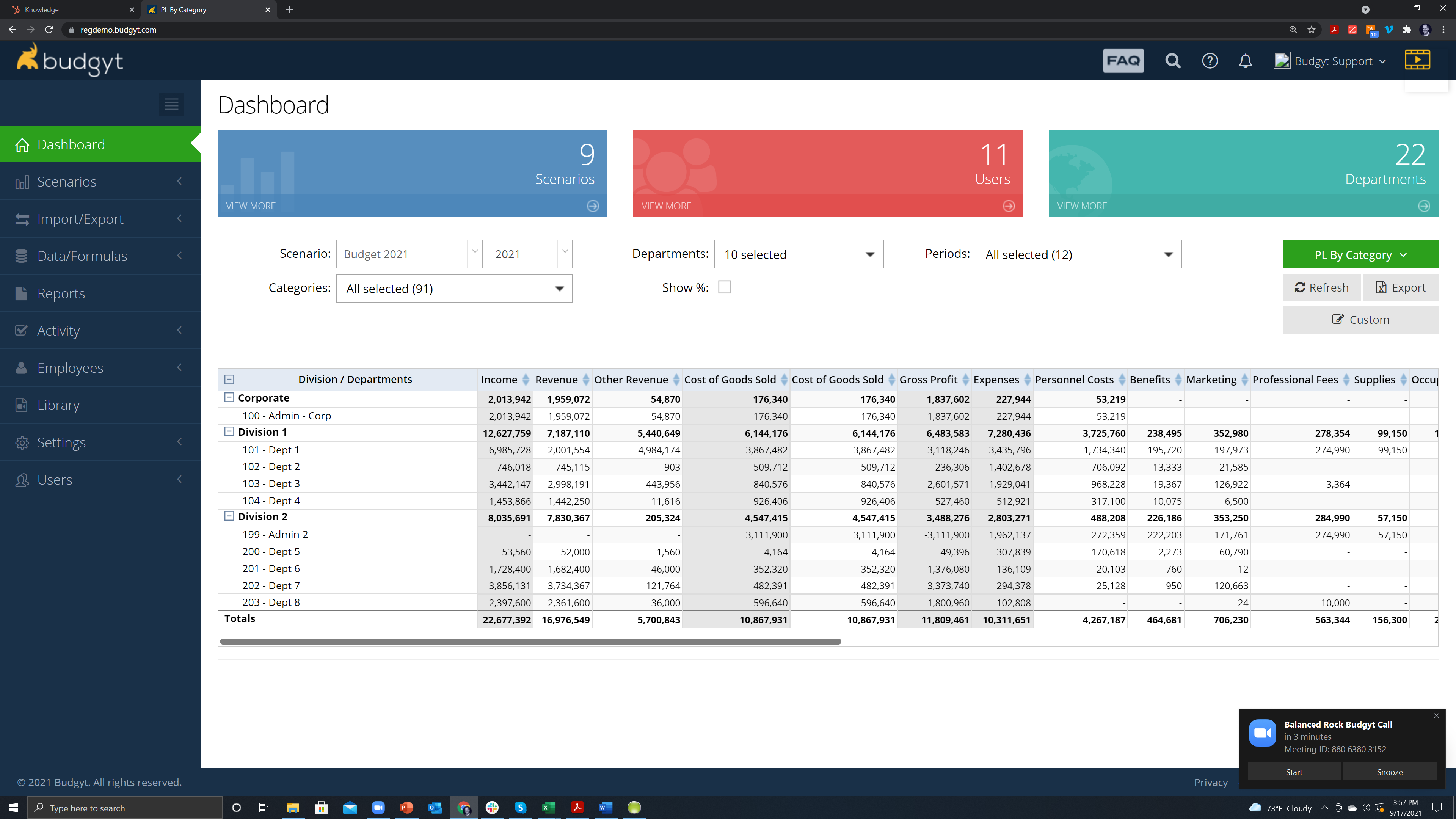
PL by Category - If you prefer to see your departments as rows, and your chart of accounts as columns, this dashboard is for you. Same menus at the top.
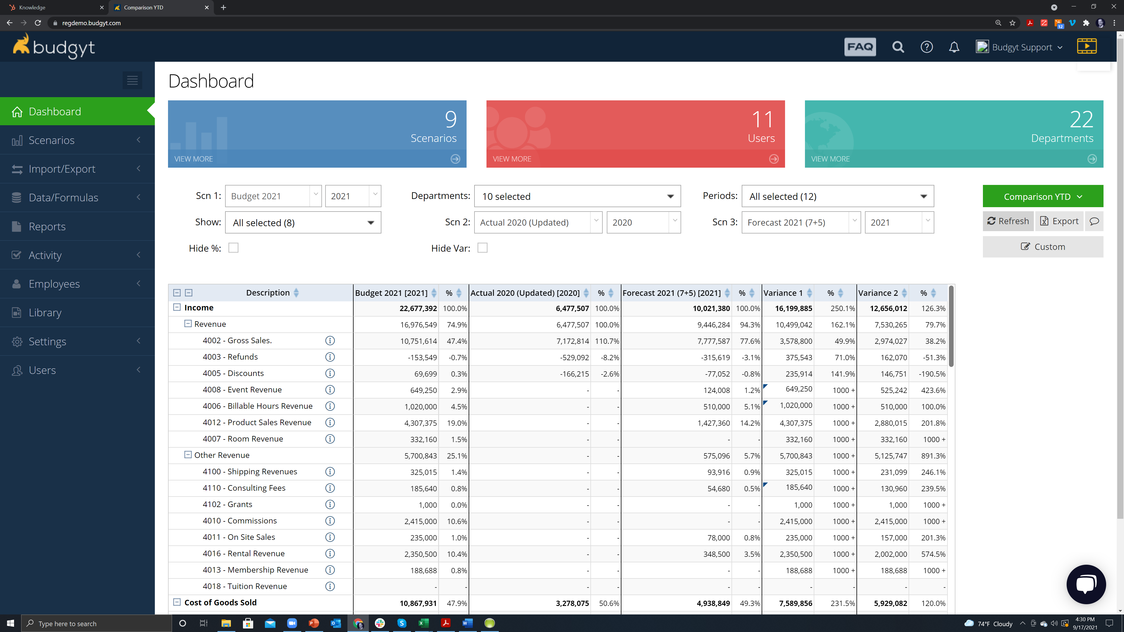
Comparison YTD/Comparison by Period - this is where you will view your Budget to Actual comparisons. You'll see there are 3 columns of data, and 3 corresponding menus at the top (labeled Scn 1, Scn 2, Scn 3) which allow you to choose the data in each column so you can compare Budget to Actual, Actual to Actual, Budget to Forecast etc. There are also two variance columns (Variance 1 is between Scn 1 and Scn 2, and Variance 2 is between Scn 1 and Scn 3), and you can choose your departments and periods again.
There are also several Employee dashboards, and you can build your own Custom Dashboards - find out more here.