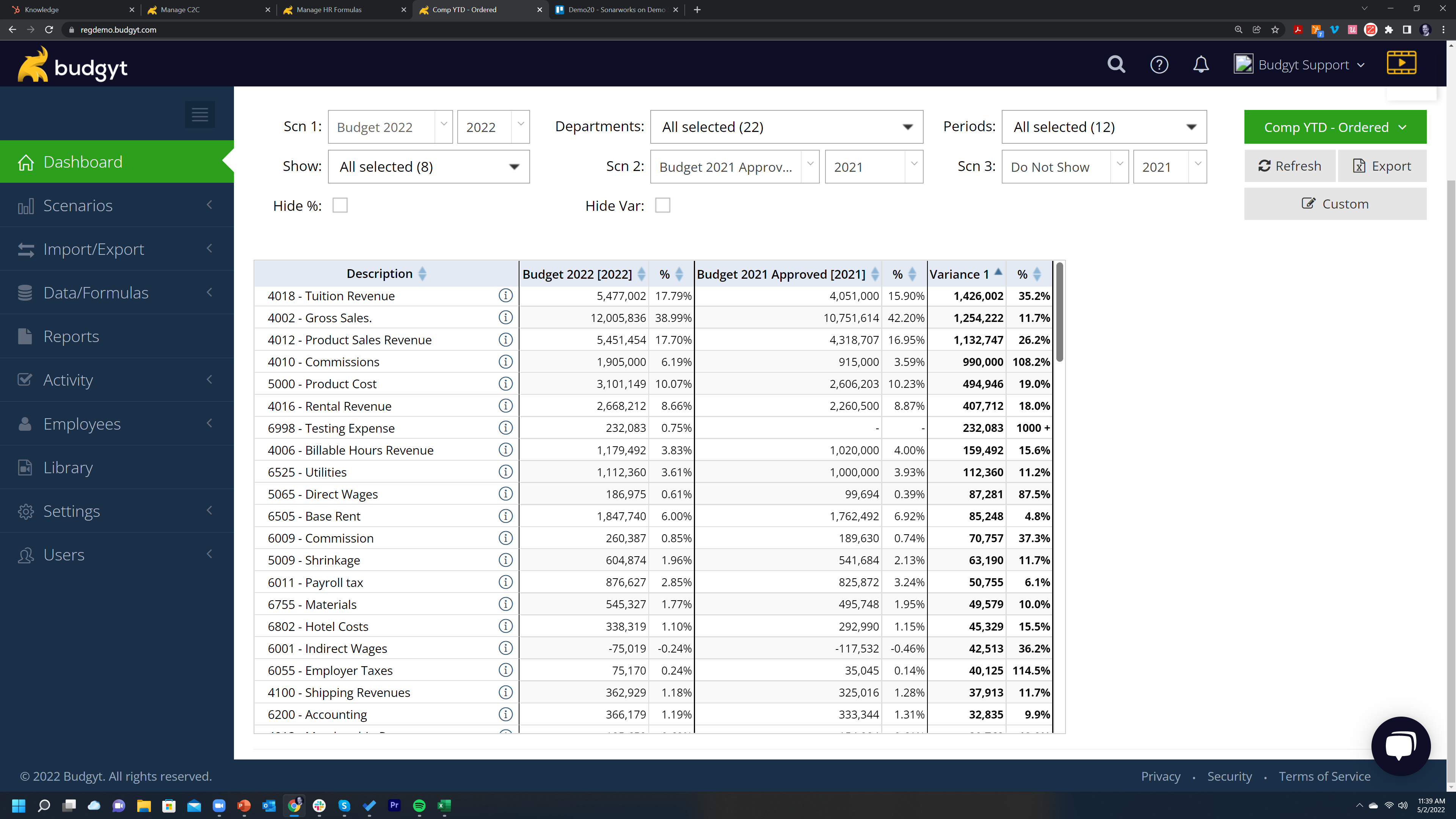
On your Comp YTD or Comp by Period dashboards you will see there's an up/down arrow icon in the header of each column. This allows you to order your data within that column, but the order is only updated within the groups in your COA.
But what if you want to order the whole chart of accounts - for instance so you can see your largest variances?
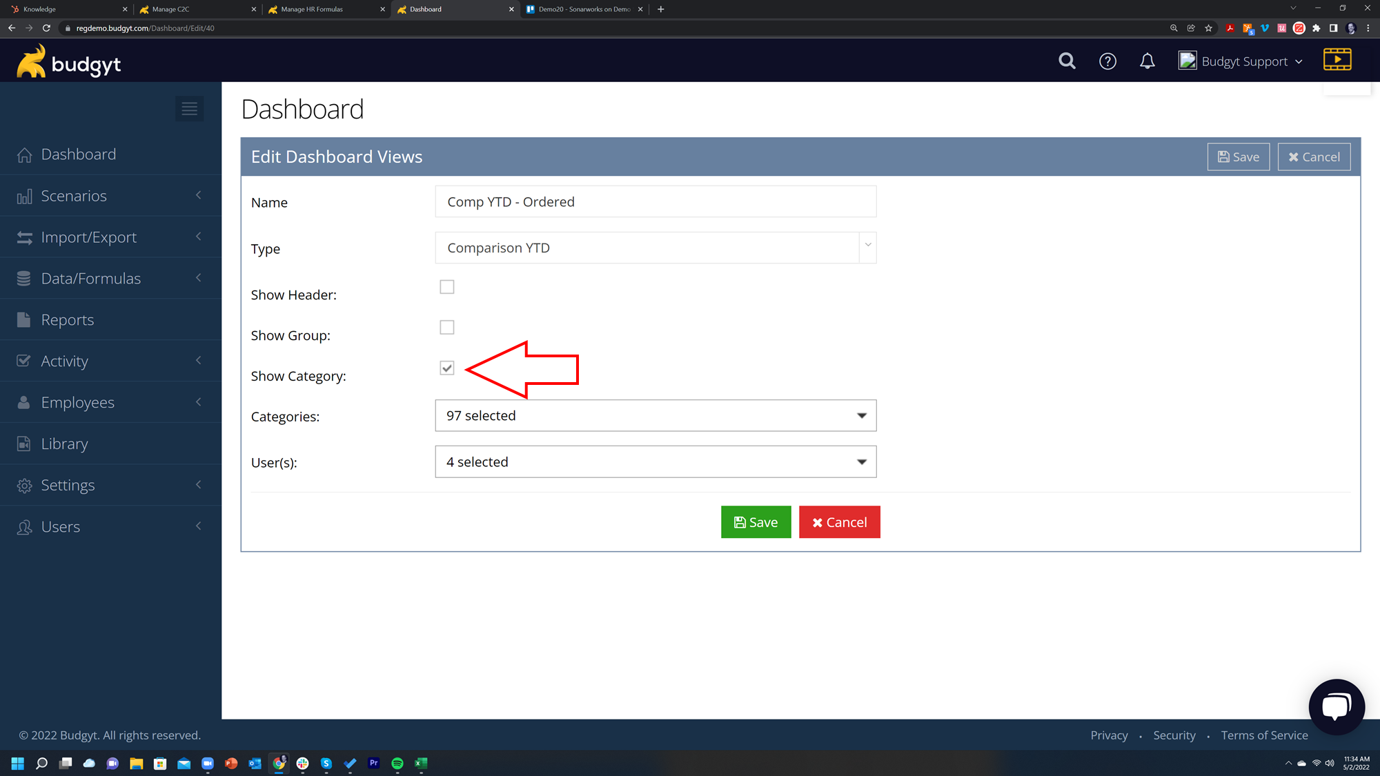
To do this you'll use our Custom Dashboard feature. On the right hand side of your dashboards, just below the Green menu, there's a Custom button: click this, and hit Add New.
Now give your dashboard a name, and choose one of the Comp types, and then ONLY check the Show Category box:
Then choose the categories you want to see on the dashboard, and the users you wish to have access. This has the effect of removing the groups and the headers from your COA so that now when you order your variance using the up/down arrows, the whole COA is ordered so you see all of you biggest variances together: